This is a guest post written by Johannes Leuchovius, designer at eLabs.
Streamio Marketing Site – The Design Process
I will explain my typical process when designing a marketing site by showing you examples from my work with Streamio.
Why Streamio? Because they are a fun company to work with, easy to cooperate with and they give clear and good feedback.
First I got a mockup from Streamio with some thoughts and wishes. It’s actually rare that you get a mockup this good from the customer:
The mockup from Streamio, which I’m very impressed with. Sooner or later they won’t need my help anymore :).
An important thing with a marketing site is to get the user’s attention. This is done by giving enough information in a short amount of time so that the user gets interested and keeps on reading further down. This means that we need to scale down the information, put it in natural order, and keep it simple and clear.
It’s quite known how much, or little, we read on the internet. Studies show that we read very little, I myself is a typical example. We browse sites very fast, and it doesn’t take many seconds before we jump to the next one. This is something we have to think about when designing web sites, we only have a couple of seconds to catch the users attention, not much more exposure than a logo. Some interesting articles on the subject are UXMYTHS – People read on the web, How Users Read on the Web and E-Mail Newsletters: Increasing Usability.
The first thing I do in the design process is to look through the information on the customer’s mockup. The second step is to make my own interpretations. My first thought on the Streamio mockup was that there was too much information and the headlines were unclear. On the following drawings I have scaled down the information and changed the layout in the at the top:
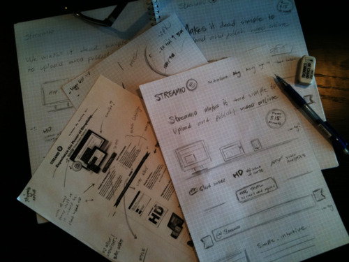
I love to draw with a pencil on paper – a great way to get your thoughts down at the beginning of the process.
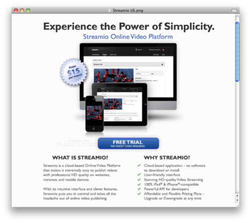
Close-up on Streamio’s mockup.
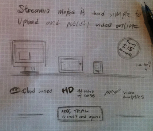
My final drawing of the design, which I showed Streamio.
What’s left is:
- a short headline about Streamio: they help you upload and publish videos online.
- then a picture of a computer and two devices with their video platform or video, to show that it works on all modern platforms.
- followed by 3 short blurbs about their advantages.
- the 3 blurbs are then put into one sentence to make it even more clear.
- a prominent Call-to-Action button makes it easy for the user to try the service.
- finally, there is a price tag with a minimum price.
When I’m done I show the customer the new drawings. This time Streamio was happy with the result, so then I continue with the next step: the real designing.
I design directly in the web browser, which is most efficient today. This way you work closer to the end result and you don’t have to work in two steps, like when you’re using Photoshop. I do additional graphical elements in Photoshop, but I constantly look at the end result in the web browser. Another great advantage of working in the web browser is that you have access to A LOT of fonts from @font-face services, such as Typekit. Today you can do a lot with the design using HTML and css3, which I’m sure you already know, but if you want to read more about it you can take a look at Smashing Magazine or NetTuts.
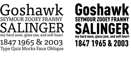
Two fonts used on Streamio’s site. The first one is the popular serif FF Tisa which I think is great! It is used for all the content on the site. The second one: FF DIN Pro Condensed, is used for the logo.
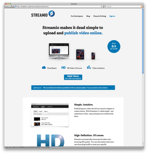
This is my first layout after the drawings. Here I have made the basic layout and placed the content, and made some screenshots and additional graphics. But it is a bit plain and boring.
Streamio likes a very sharp and glossy style, and I won’t say no to that. A lot of sites can’t pull this off, but I think it gives a great vibe and harmony to this site and it works with Streamio’s kind of service.
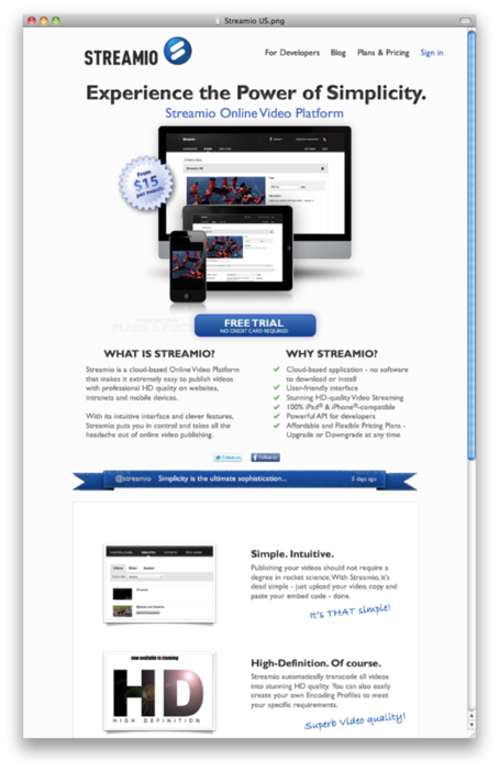
Some screenshots from the final site:
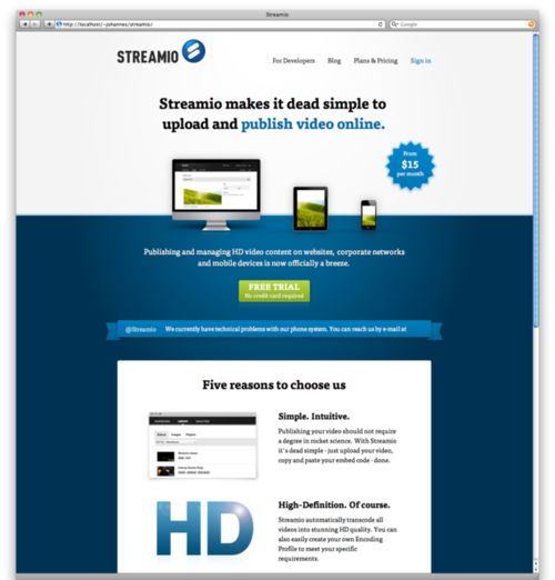
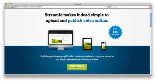
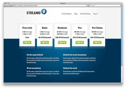
I really like the last page because it’s only built with three images. It’s a fun challenge to try to use as few images as possible. This keeps the loading time for the site short or rather compensate for custom fonts.
Streamio launched its site on March 7th. It looks a bit different from my final version because they combined some of the final designs with some of the earlier to create what they want.
Take a look at Streamio.com.
In my next blog post I will write about the design process behind the actual video tool which David at Streamio has developed and I’ve made the design for.
If you have any comments or questions, you can text me on twitter: @leuchovius, Thanks!

